Designing a booth for a trade show isn't easy. You have to consider the scale of the booth, the number of people you want to accommodate, what feelings you want it to invoke, and much more.
Now how would you go about designing such a booth?
In the following, I will highlight a few steps that we took to make our booth design stand out and be memorable. Please note that this is not a step-by-step guide, but rather a collection of thoughts and ideas that I had while designing the booth, and thus in no way represents a "best practice" for designing booths.
Purpose
When starting a bigger project such as designing a fair booth, it is important to outline the fundamental purpose the project should follow. In this case, some booths are designed to be informative and information-packed, and others are designed to just show "presence" at the trade show. And yet others are designed to catch the eye of the visitors and make them stop by.
The latter was what we wanted to go with, since with us launching version 2 of our product, we wanted to show that we've completely reinvented ourselves. We've gone from a small startup to a full-fledged company with a product that is being used by some of the biggest names in the industry and therefore wanted to show that we are a force to be reckoned with.
At the same time, this was our first time exhibiting at ITB and having our dedicated booth, so we wanted to make a good first impression. Thus we decided to go for a design that is mainly an eye-catcher that attracted potential customers. And let me tell you, attracting customers it did!
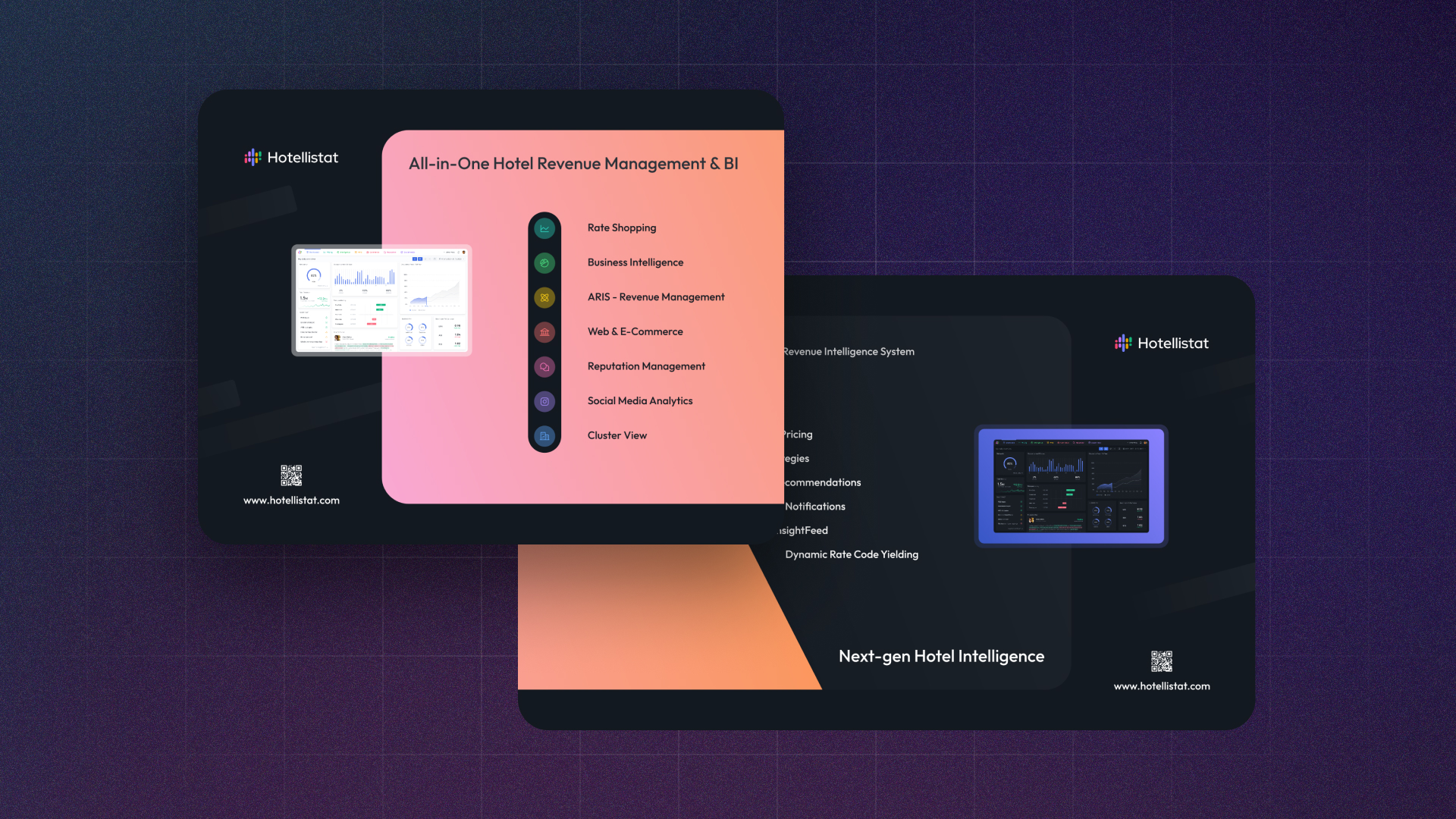
Supporting that, we opted for background illuminated walls that had a large array of LED lights embedded in the rim. This allowed us to express colors and patterns that would otherwise be impossible to achieve without a large amount of additional lighting.
Competition
Once we knew the fundamental purpose of our booth, we needed to check out what our competitors were up to. It allowed us to see what works and what doesn't, what's possible and what's not, and validate established patterns in conjunction with target audiences.
In our case, a large amount of them were designed as information-packed walls with loads of "happy people" stock images, white backgrounds, and tiled information areas. This is a very common design for b2b companies, but it does feel very corporate and unimaginative and is just something we can't identify ourselves with.
Here's an example of such a booth:
 (Generated with stable diffusion)
Can you feel it? It's Kinda cold, isn't it?
And that's exactly why we wanted people to feel cozy and safe when they entered our booth. They should feel like they are at home and not in an over-imposing clinical showroom full of salespeople. Since many of our competitors went with that generic white-background-with-tiled-highlights design as emphasized above, we wanted to stand out and be different. We wanted us to be the booth that people would remember, and that's when we decided to go with a warm color palette on a cozy dark background.
Visual Style
Now that we've decided on the general color palette, we needed to come up with a good visual design and style.
There are several ways of building up a visual hierarchy that promotes the feelings of coziness and safety, that we want to convey. One way you can achieve this is by making the booth look visually smaller than it is. This is a common practice that is well established in the interior design industry, which, by darkening the walls within a room and visually focusing on a specific area through light hotspots, gives you the feeling of safety. Campfires would be another good example for that. And that's exactly what we wanted to achieve.

For completeness's sake, here's a perspective view of the booth:

Requirements
A cool design is nice and all, but it's not enough if you don't take into account certain requirements. In the following, I'll highlight a few of them, that you might also want to incorporate into your design. A base principle to keep in mind though is: You're designing for humans, not other designers.
Eye-level elements
Visual elements in your booth need to be comfortable for people to look at. We — humans — don't like looking up or down at something for extended time periods but rather prefer looking straight out into the distance. Therefore, it is crucial to make sure that the most important elements of your booth are at eye-level height. This is especially important for mockups or TVs that are used to display information.
If we look up the average height of a human, it tends to be around 1.7m. Taking into account that we are mainly active in European markets, and thus the average height is a slight bit taller, we decided to go with an average height of around 1.75m. But that's the average human height, not the average eye-level height. So after doing complex super-advanced much science wow ™, we arrived at the extremely precise and well researched eye-level height of 1.60m.
And this is the height at which we placed the most important elements of our booth, which would be the mockup of our tool and the TV.
Readability
Another important aspect of designing a booth is finding the right text size, since you want to make sure that people can read the text on your booth from a distance. If they can't read it, they might churn and not even come to your booth, so one has to take great care that the especially relevant information is clearly visible.
At the same time though, just blowing up your logo and text to extreme dimensions comes across as tacky and unprofessional. So it's important to take a middle ground. In our case, we made the text large enough to be readable from a distance, but not so large that it made us look needy for attention.
If people are interested in you, they'll find you anyways, and if you balance your text size just right you'll find, that people like to inspect what you have to show, from close up, allowing you to then initiate a conversation with them.
Referencing further information
Creating a design is all nice and good, but you also have to give people a chance to easily fetch more information if they're interested. That's why it's also important nowadays, to add a QR code as well as your domain to marketing material such as banners, flyers, or — who would have guessed — fair booths.
Design Process
Let's have a look at the process of iteratively designing the booth.
When I sat down to create the first draft for the booth, I initially didn't quite know where to start. So I just sketched out a rough design on paper and created a simple validation it the 3D booth viewer.

Although rough, I liked the layout and fundamental design direction this was going. Using blue highlights to contrast with warm orange-red colors is often used in the film and photography industry for an attracting-opposites effect. So color wise I was rather happy already, but I didn't like the transition between the two walls. It was very harsh.
I came up with an improved design to fix up that transition a bit:

This already looked better. It was more consistent and pleasing to the eye. I also added some small features to the left and right whitespace areas to make them a bit more interesting to look at.
But alongside this change, I now had the problem that the blue TV frame was very close to the orange color. It looked like those two colors were fighting for attention and made the whole wall uneasy to look at. To find a good compromise I divided the right wall into two sections. A left section — which has a warm background — guarantees a nice transition between the walls and a right section — that has a dark background and acts as negative space — to give the blue TV frame a chance to breathe.

I also increased the space from the top and bottom edge of the walls to the inside "Island" to make it a bit more distinguishable from the floor.
At every step of the process, I made sure to note down the feedback of the team. It's very easy to get stuck in your ways, so it's great to have people around that give you different perspectives and constructive criticism.
Better safe than sorry, right?
The whole design was initially prototyped in Figma but later moved over to Inkscape due to its better size handling and PDF export functionality.
Final Stages
After having finalized the design, it was time to get it printed. For that, I had to follow the print specifications of the illuminated wall manufacturer.
In this case, our prints needed a few centimeters overscan and needed to be exported at a minimum 300ppi resolution. The final print of the walls took around 10 days to arrive at our offices, so that was petty quick. The whole wall setup — which was 4x3 and 5x3 meters by the way — arrived in 5 rather large suitcases that were custom designed to fit all the parts of the walls.
Result


The booth was a huge success! The feedback on our design was very positive, indicative of our new strategy towards design and marketing.
We've also received a lot of attention from people that aren't even in the hotel business and were just interested in what we were doing. Maybe that's because we gave them free drinks? Who knows ¯\_(ツ)_/¯
Anyways, it was heaps of fun doing this project and I can't wait for what we'll come up with next year at ITB 2024
Hope this small insight into our process was interesting, feel free to reach out if you have any questions!