In the world of user interface design, neutrals are colors that are used to create visual hierarchies through their brightness. They define the look and feel of any user interface you encounter and are often underdeveloped leading to a bad user experience.
Have you ever wondered why some color themes on websites feel kind of off? Did they feel jarring to look at and uncomfortable to read? Well, that could be, because they didn't fine-tune or use their neutral color palette correctly.
Think of neutrals as all the whites, grays, and blacks that you encounter in an application or website — the neutral colors so to say. They're the most used colors and need to be able to complement any other used color in your interface, yet hardly anybody notices them. For most people, they just look like different variations of gray, but they're so much more!
In this short post, I'll highlight some nice neutral color palettes that I've come across, how to use them in your UI, and what to look out for when creating your neutral palette. We'll use a pretty cool tool called Primer Prism with which it's super easy to create your palettes in a very intuitive way.
Good neutral color palettes
Any time I've visited a website and found that their neutrals looked especially nice, I copied them down for later reference.
Here are a few of them, so you can use them as a basis for building your palette, or just reuse them!
Colors aren't owned by anybody after all.
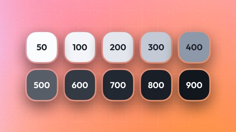
Hotellistat
Github
TailwindCSS
Using your neutrals
In this section, we'll check out some good guidelines to go by, when using your neutrals in your UI.
Text contrast
When using neutrals for text, you should always make sure that the contrast between the text and the background is high enough. This is especially important for people with visual impairments, but also for people who are just tired and want to read your content.
But don't just use a black-on-white approach, funnily enough, that's one of the worst things you can do aside from not being accessible.
Here is an example of a bad text color usage vs a good one:
switch the theme on this website in the top right corner to see the difference on an inverted color set
Notice how the text in the bad example is hard to read, and the text in the good one is much easier to read and also looks nicer?
Yeah, well, that's because the contrast between the text and the background is much higher on the right side causing a "hazing" effect around the contours of the characters. This hazing effect also causes light text on a dark background to look much bolder than dark text on a light background since light colors tend to "spill" into dark ones.
Don't get me wrong though, there is a place where you might want to use completely white colors on a dark background and vice versa, but be sure that decision is deliberate. The more text and the smaller it is, the more important it is to have the right contrast.
As a rule of thumb, you should always use a contrast ratio of at least 4.5:1 for text, and 3:1 for large text, if you need specific numbers.
Color pairings
Your neutrals need to complement your primary colors. So if you use e.g. blue as a primary color, make sure that your neutrals are also in the blue color spectrum.
Here an example of what could go wrong:
switch the theme on this website in the top right corner to see the difference on an inverted color set
Warm neutrals tend to not mix very well with cold colors and neither do cold neutrals with warm colors. This is because the human eye is very sensitive to color temperature, and will perceive colors that are too far apart as "off".
Utilize the nearest neighbors
When building up a visual hierarchy with your neutrals, you should try to use the nearest neighbors in the neutral color spectrum to not over-contrast your UI elements:
This makes your UI look much more harmonious and easier to digest.
Creating a new palette
Now what we've seen some nice palettes and learned how to use them, let's create our own with Githubs open source Primer prism, a very handy tool to create new color palettes and neutrals.
1. Getting started
After navigating to Primer Prism, you'll see some palette projects that might already exist. If not, click on the add button in the top right corner to create a new palette project.
After opening your project you will see this screen:
Feel free to clear any already existing palettes and neutrals, we will create our own.
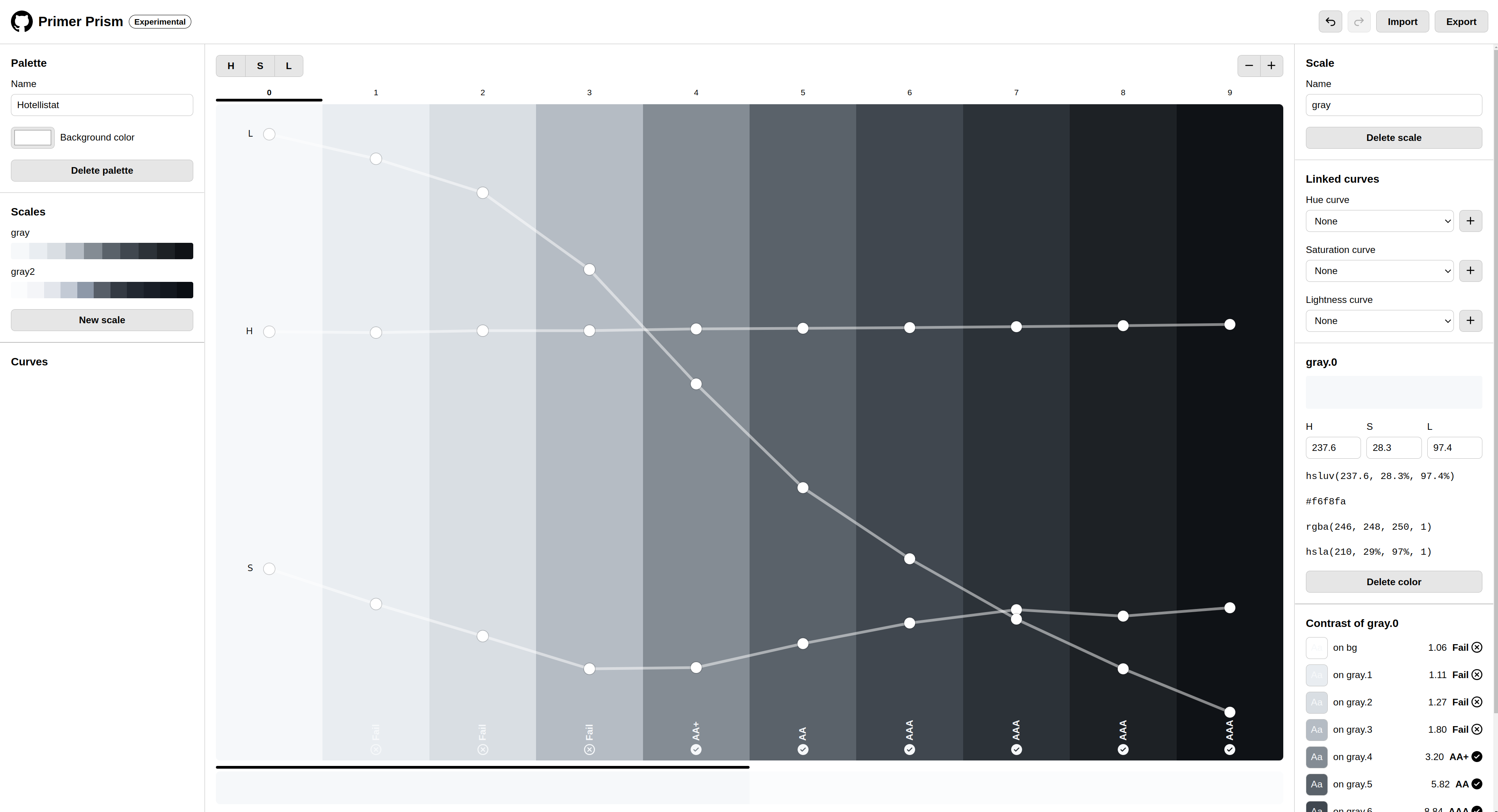
2. Creating a new palette
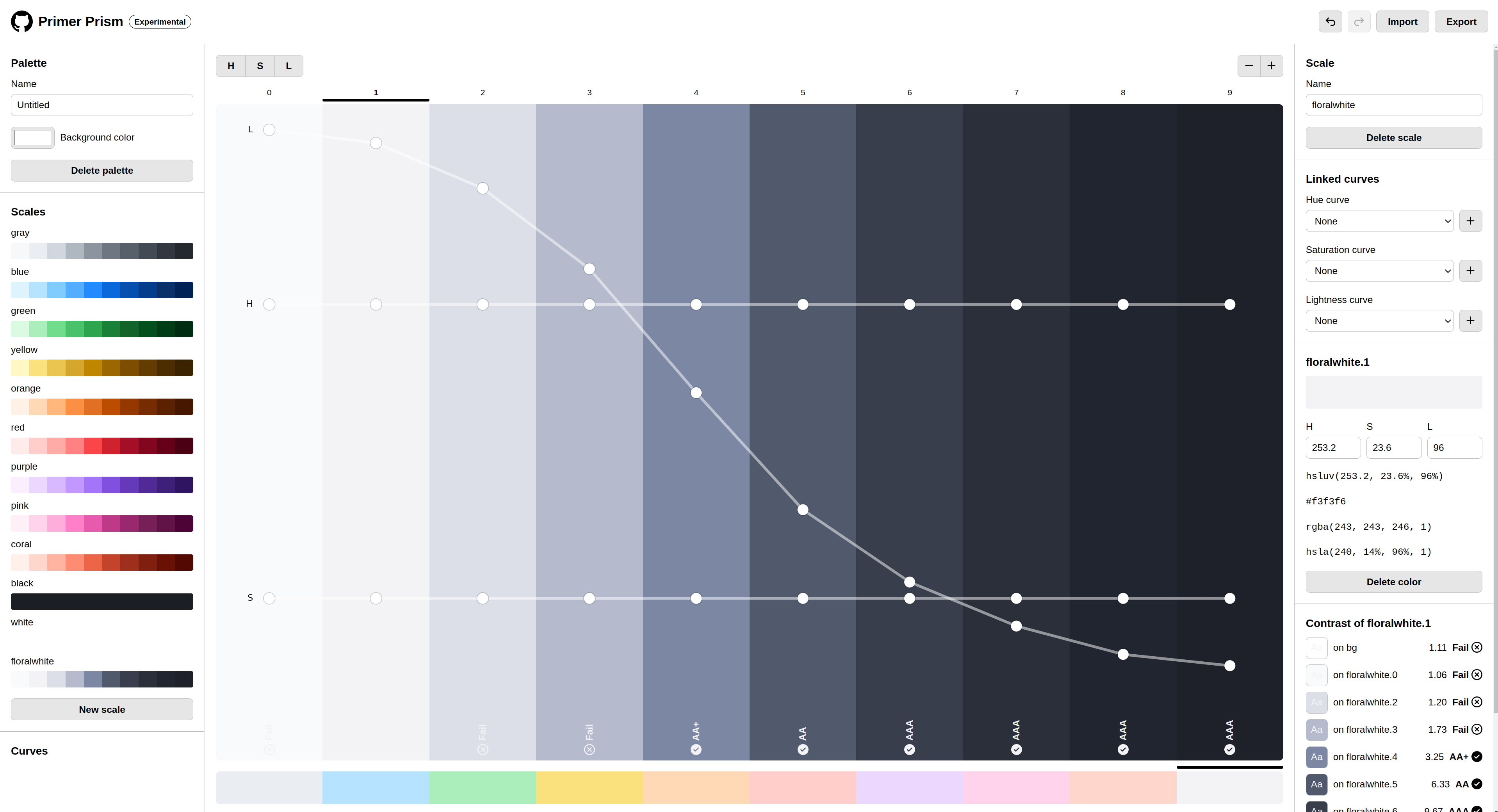
If you click on the "new scale" button on the bottom left side, you can create new color palette scales. You'll then be presented with a default scale color.
Note the three buttons in the top right. These H S L buttons are used to change the visible slider lines in the scale. These slider lines can be used to change the Hue, Saturation, and Lightness of the colors you want to add.
Now add a few colors to your scale on the top right until you have around 10 colors:
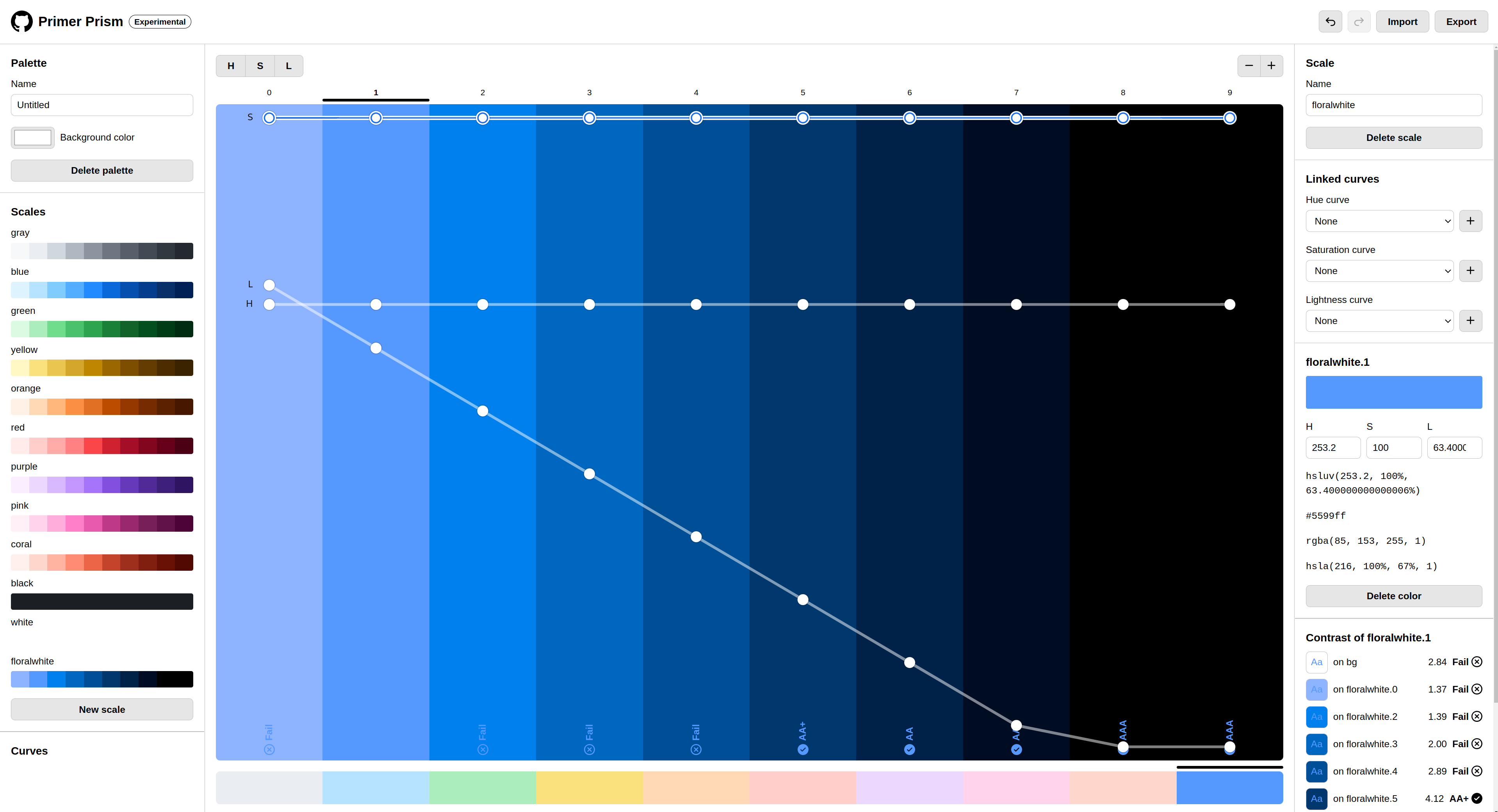
3. Adjusting your palette
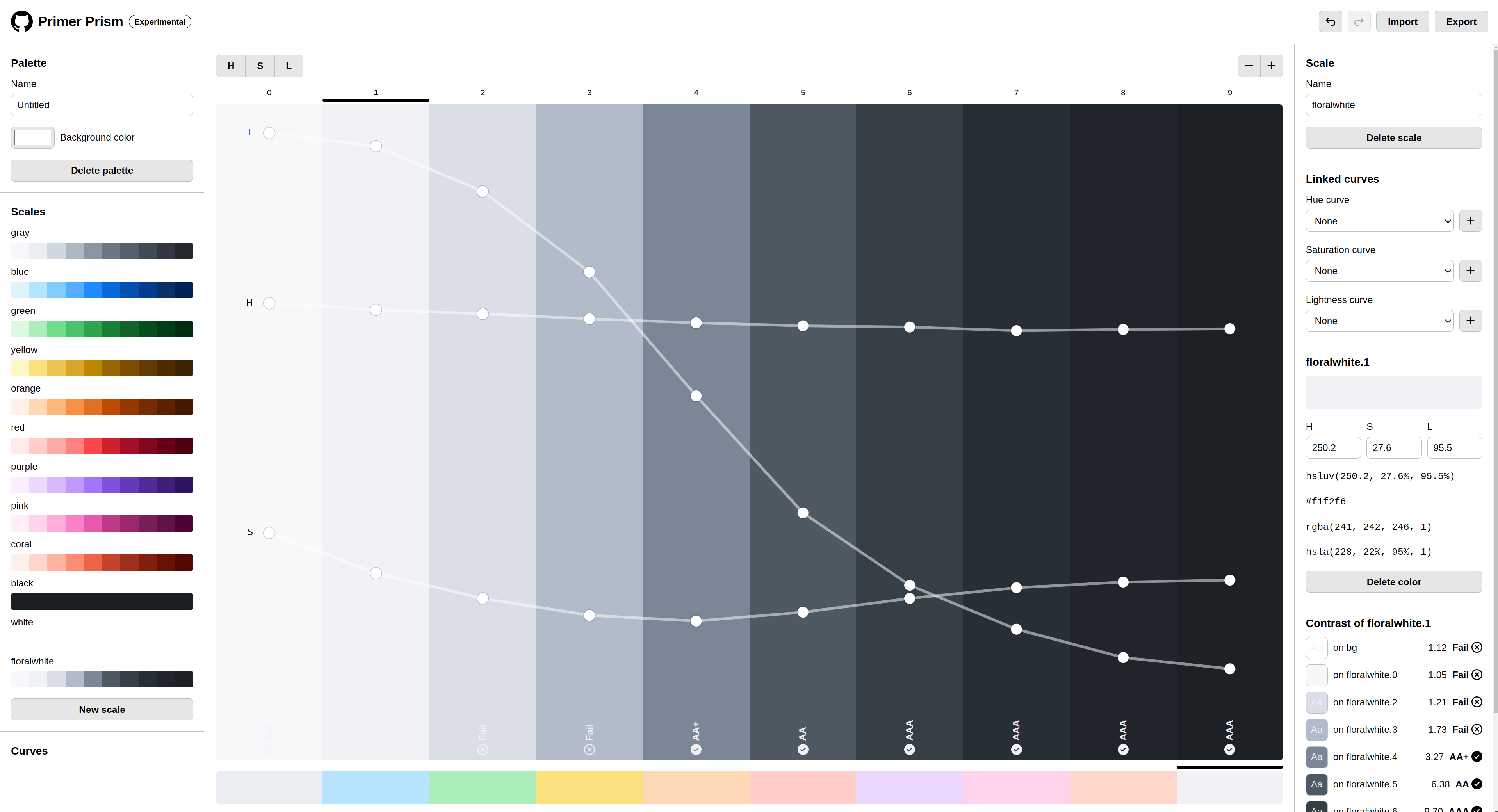
As you can make out the colors are quite blue, so let's change that by reducing the saturation of the scale to become more grayish:
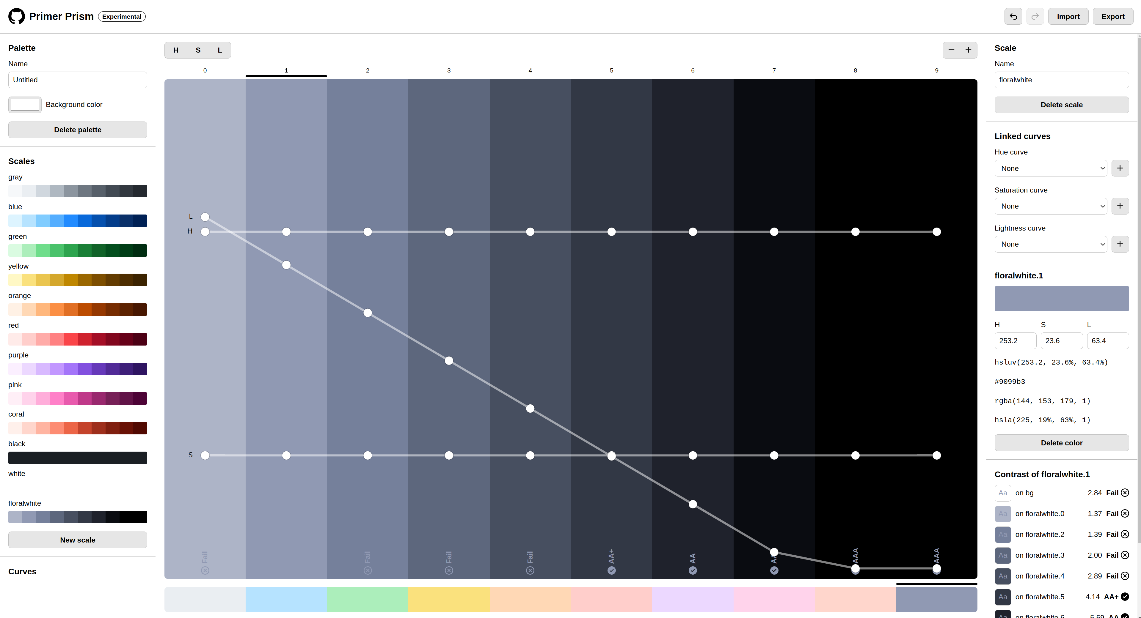
Nice! So we already have a pretty good foundation for our neutrals.
Let's now have a look at the Lightness line. Configuring the lightness in your neutrals might be one of the hardest tasks. If your neutral steps are too far apart, they will look too different in your UI (like highlighted above) while if they're too close together, they will look too similar and your UI will look too flat as well as wasting precious color-slots that could be filled by other neutrals.
It's important to find a good balance between your steps. In general, you would want your Lightness curve to follow an "S" shape. Why you ask? Because it's much more probable that you need a higher neutral resolution on the two ends of your spectrum since you either have a very light UI or a very dark UI.
So let's adjust our Lightness curve to follow that "S" shape:
Much better! And that's pretty much it. Of course, you will still have to do a lot of fine tweaking, since the real world is not as perfect as setting your color curves to follow certain shapes. Monitors can affect your neutrals, as well as human perception. So please do your research on which colors work best for you.
5. Hue and Saturation
What about the HUE slider? you may ask. Well, that's a bit more tricky. As said, the real world is not perfect, and that also applies to the actual color perception of humans. Since some colors are inherently darker than others (e.g. Yellow vs Blue) you will need to adjust your HUE curve depending on what palette-foundation you use. If you create a violet palette, you will run into trouble figuring out good colors in the very light area of your spectrum. A trick to solve this is to shift your colors slightly into a brighter color HUE and play a bit with your Saturation values, the lighter your spectrum gets. Check this out:
This looks much more balanced now. But again, this is just a general guideline. You will have to do a lot of fine-tuning to get the perfect palette for your project.
I hope this post helped you understand neutrals a bit better. I will be updating this page with more examples and tips in the future, so stay tuned!